Unveiling TikTok Advertising Secrets
Explore the latest trends and insights in TikTok advertising.
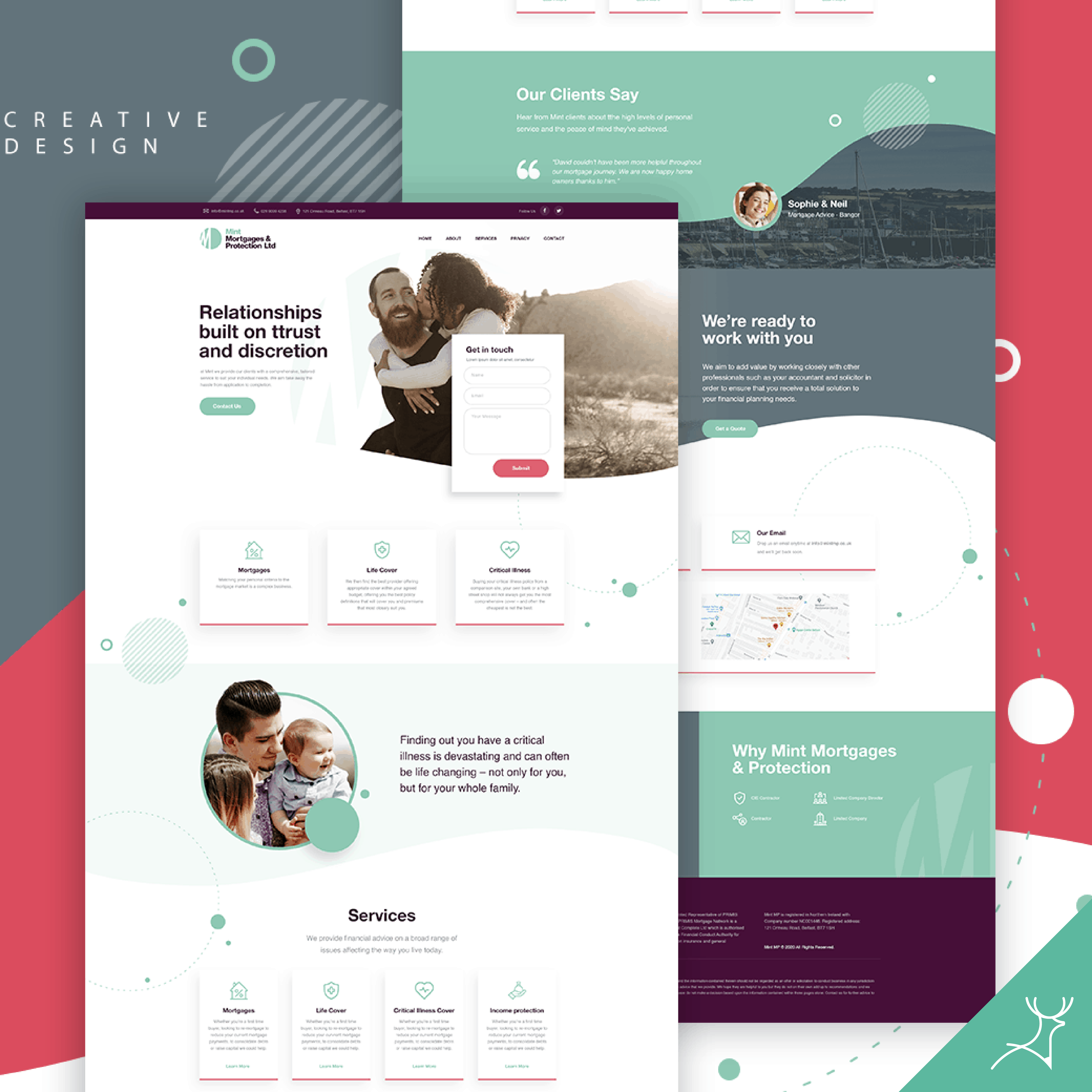
Landing Pages That Sell: Design Tricks You Won't Believe
Unlock the secrets to high-converting landing pages with mind-blowing design tricks you never knew existed!
10 Surprising Design Elements That Boost Landing Page Conversions
When it comes to enhancing your landing page's performance, design elements often play a more crucial role than you might expect. Here are 10 surprising design elements that can significantly boost your landing page conversions:
- Color Psychology: The colors you choose can evoke emotions and influence buyer behavior. Utilizing contrasting colors for call-to-action buttons can make them stand out and increase clicks.
- Whitespace: Adequate spacing gives your content room to breathe, making it easier for visitors to focus on essential elements.
- Images and Videos: Incorporating high-quality visuals can capture attention and convey your message effectively, often resulting in higher engagement.
- Typography: The right fonts can enhance readability and guide users through the content. Using larger, bold fonts for headlines helps in creating a visual hierarchy.
- Trust Badges: Adding elements like testimonials or security seals can build credibility and reassure visitors about taking action.
- Mobile Responsiveness: More users are accessing sites on mobile devices, so ensuring your landing page is mobile-friendly is critical for maximizing conversions.
- Urgency Elements: Countdown timers or limited-time offers can create a sense of urgency, prompting users to take action quickly.
- Exit-Intent Popups: These can capture potential leads by presenting a special offer just as a visitor intends to leave.
- Interactive Elements: Features like quizzes or calculators can engage users, making them more likely to convert.
- Minimalistic Design: A straightforward layout that reduces clutter can enhance user experience and encourage conversions.

Is Your Landing Page Missing These Key Persuasive Features?
When evaluating the effectiveness of your landing page, consider whether it includes key persuasive features that drive conversions. A compelling headline is essential; it should grab the visitor's attention immediately and convey the core benefit of your offering. Additionally, integrating social proof elements such as testimonials, reviews, or case studies can significantly enhance credibility and encourage potential customers to trust your brand. Don't overlook the importance of clear and concise calls-to-action (CTAs) that guide users toward the desired action, whether that's signing up for a newsletter, making a purchase, or downloading a resource.
Moreover, the overall design and layout of your landing page play a crucial role in persuasion. A clean, professional look helps to maintain user engagement, while strategically placed visuals can support your message and keep attention focused. Consider using bullet points to highlight the most important features of your product or service, making it easy for users to scan and absorb information quickly. Finally, ensure that your landing page is optimized for mobile responsiveness, as an increasing number of users are browsing on their phones. Incorporating these key persuasive features can make all the difference in improving your landing page's performance and ultimately increasing your conversion rates.
How to Create Eye-Catching CTAs That Drive Sales
Creating eye-catching CTAs is crucial for driving sales and enhancing user engagement on your website. To start, consider the design of your CTA buttons. Using contrasting colors can help them stand out from the rest of your content, drawing the attention of visitors. Furthermore, an effective CTA should employ concise and action-oriented language that clearly communicates the desired outcome. Use words like “Shop Now,” “Get Started,” or “Join Free” to spur action. Experimenting with different sizes and shapes can also impact their visibility; rounded buttons tend to feel more inviting compared to sharp-edged designs.
Another essential aspect of creating compelling CTAs is strategic placement. Position your calls to action where they are most likely to catch the user's eye, such as at the end of blog posts, in the middle of engaging content, or as pop-ups during key moments. A/B testing is invaluable in this regard, allowing you to compare different CTAs to determine which resonates best with your audience. Additionally, incorporating urgency can greatly enhance their effectiveness. Phrases such as “Limited Time Offer” or “Only a Few Left!” instigate a fear of missing out, encouraging users to take immediate action.